A Kinetic Facade Represents Hope & Healing
By Gina Chang
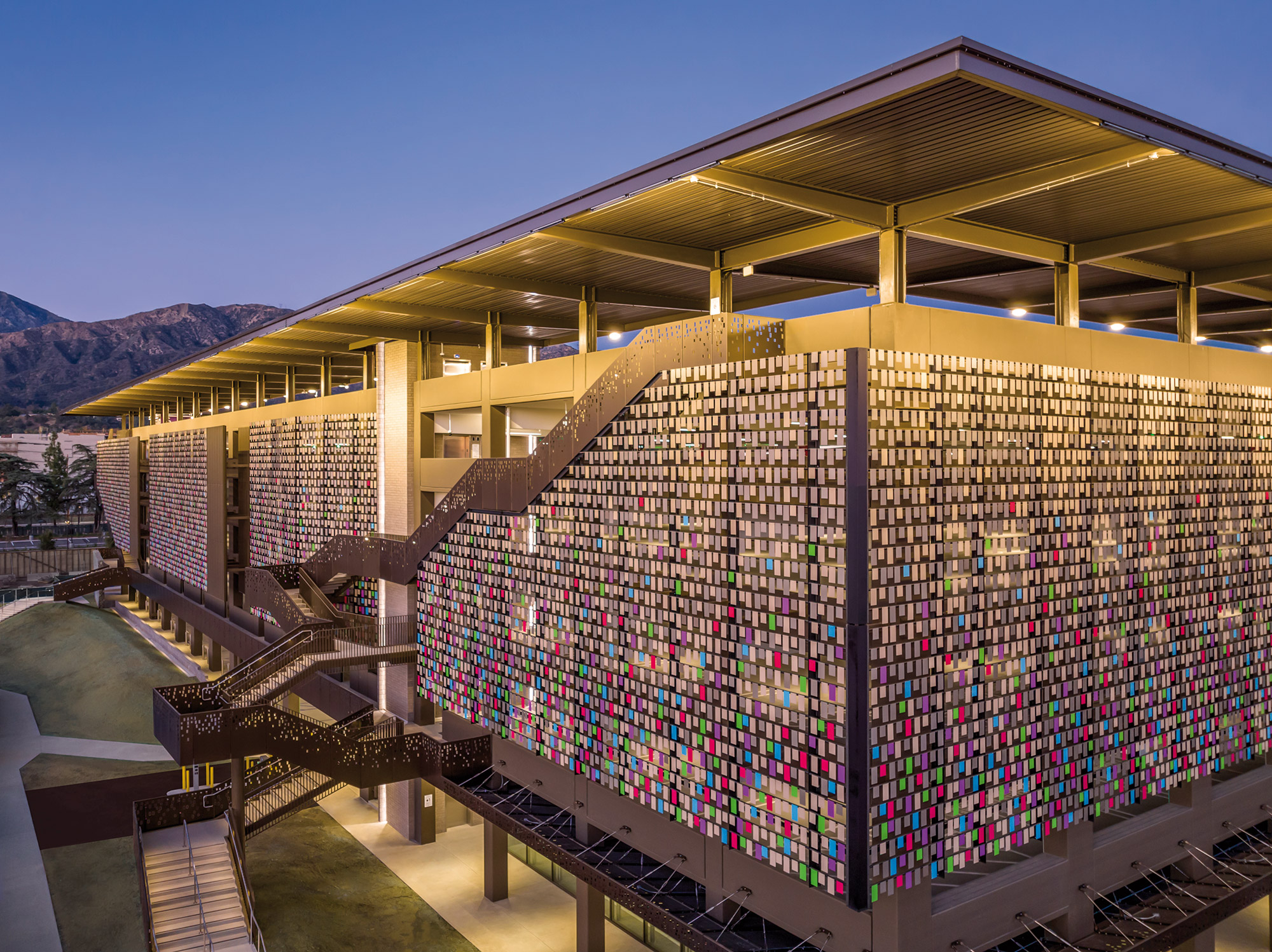
Located at the prominent main entry to City of Hope's flagship Duarte campus, the Northeast Parking Structure serves as a welcoming symbol of hope for patients, visitors and staff. Clad on three sides with a colorful kinetic facade, the structure’s skin creates a soothing and dynamic motion that responds to the wind. This serves as a calming backdrop to the expansive Ted Schwartz park, dotted with sculptures and art, as part of the journey to the new Duarte Outpatient Center (by CO Architects). Ribbon stairs with perforated metal railings flow down and cantilever off the face of the building, providing a safe pathway for accessible parking and bringing visitors directly into the park. The parking structure serves as a beacon for those arriving from the Metro Gold Line station, guiding visitors through the green space and towards the campus.
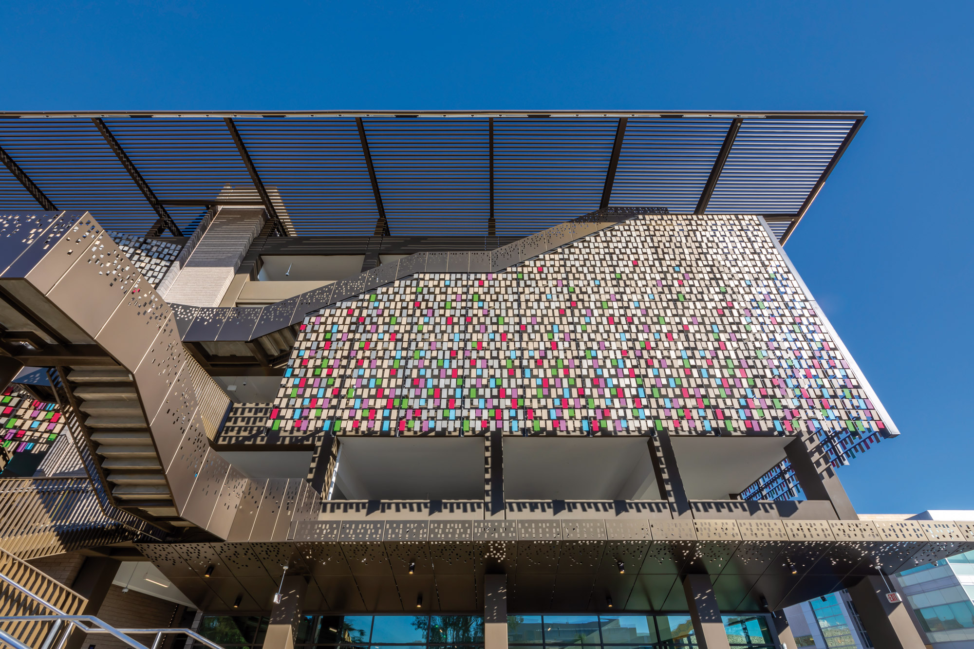
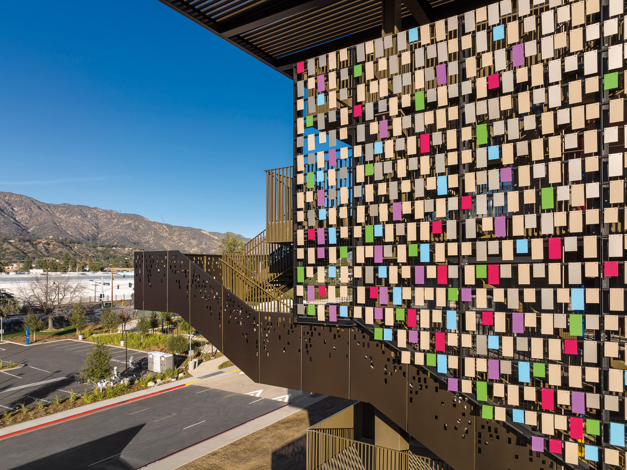
The aluminum "tags" in shades of vibrant colors of Kynar coating are inspired by a prominent tradition of City of Hope's rich culture and heritage – the “wishing tags”. Patients, friends and families tie brightly colored tags filled with messages of hope and healing to trees on campus. City of Hope expressed to the team that hope and joy are integral to the holistic experience of healing in cancer care. The breezy conditions onsite enable gentle movement of the facade to create a positive distraction for infusion patients enduring long treatments in neighboring buildings.
"First of all, I would like to thank you for the beautiful parking structure you built. When we are at City of Hope the outside of the building is a bright spot for us. We can just watch the beautiful colors and it can make us smile, and when it blows in the wind it is calming and beautiful at the same time."
Patient Family Member
The design was proven out through use of digital and physical mockups. Parametric programming defined the patterns of color and tag size across the massive facade, while the physical mockups tested movement using wind on the actual site.
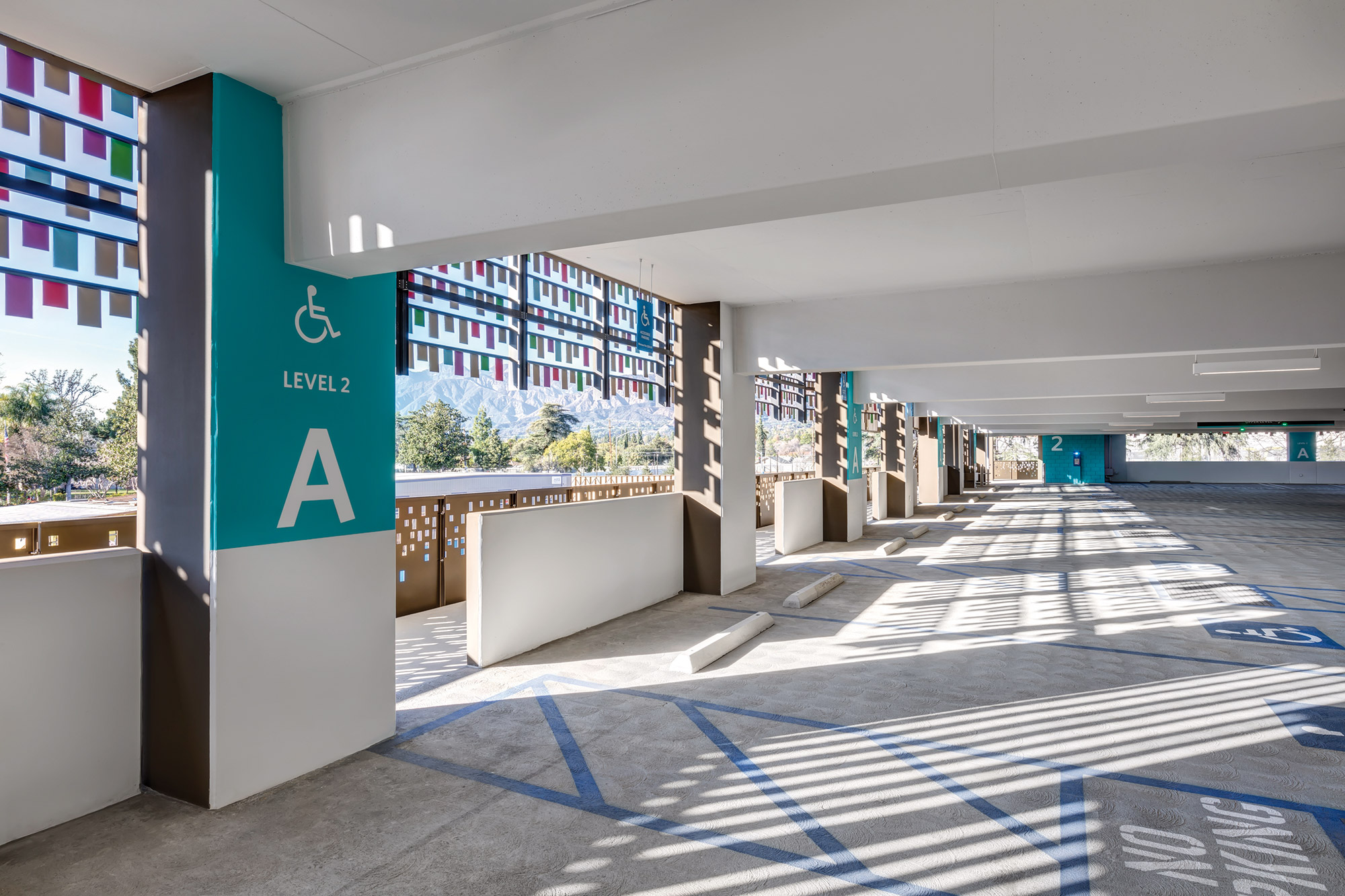
Enhanced signage and graphics in matching colors of the tags are found on each level of the structure to help distinguish which level users are parked on. The interior walls, columns and slab soffits are painted white to provide a feeling of brightness and safety and enable lighting to be more evenly distributed throughout. The tags cast shadows on the interior of the parking structure, creating a playful moving pattern on the floors.
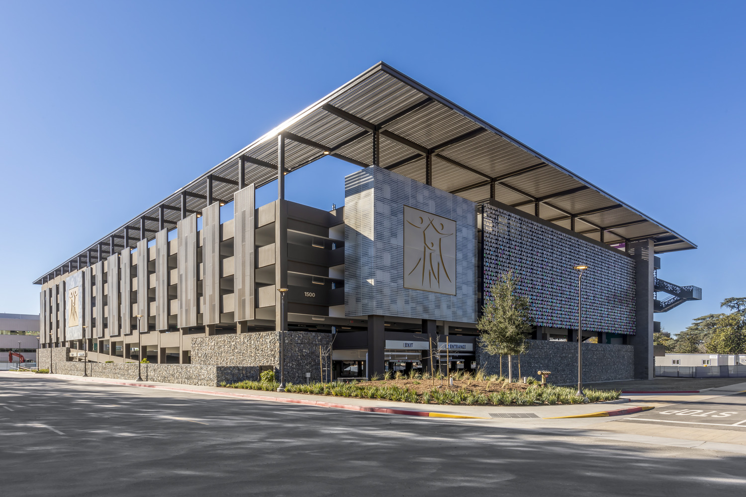
At the ground level, the base of the building design uses natural materials like rocks placed in gabion walls to represent the neighboring cobble walls of the adjacent river wash from the San Gabriel Mountains. The structure is a naturally ventilated, post-tensioned concrete with space for 1,087 vehicles. It is planned to meet parking structure efficiency standards and houses a 15,000-sf retail shell space on ground level.
