A Flexible & Responsive Design for UC Riverside’s School of Medicine Education Building II

Take a deep dive into the design philosophy that drives the CO Architects | Hensel Phelps design-build project at the University of California, Riverside. Explore the details in the interior and exterior architecture of the School of Medicine Education Building II.
By James Simeo and Tanner Clapham
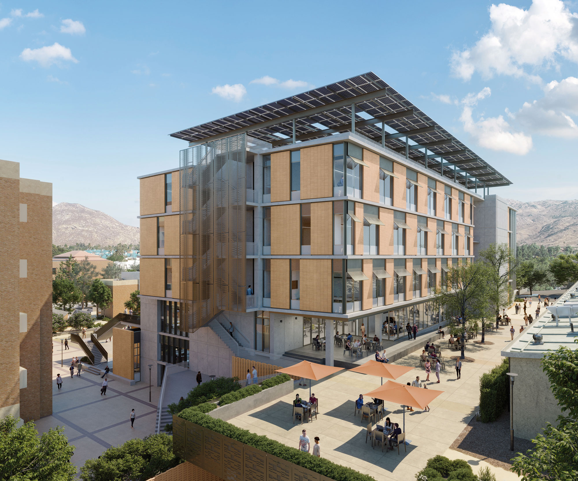
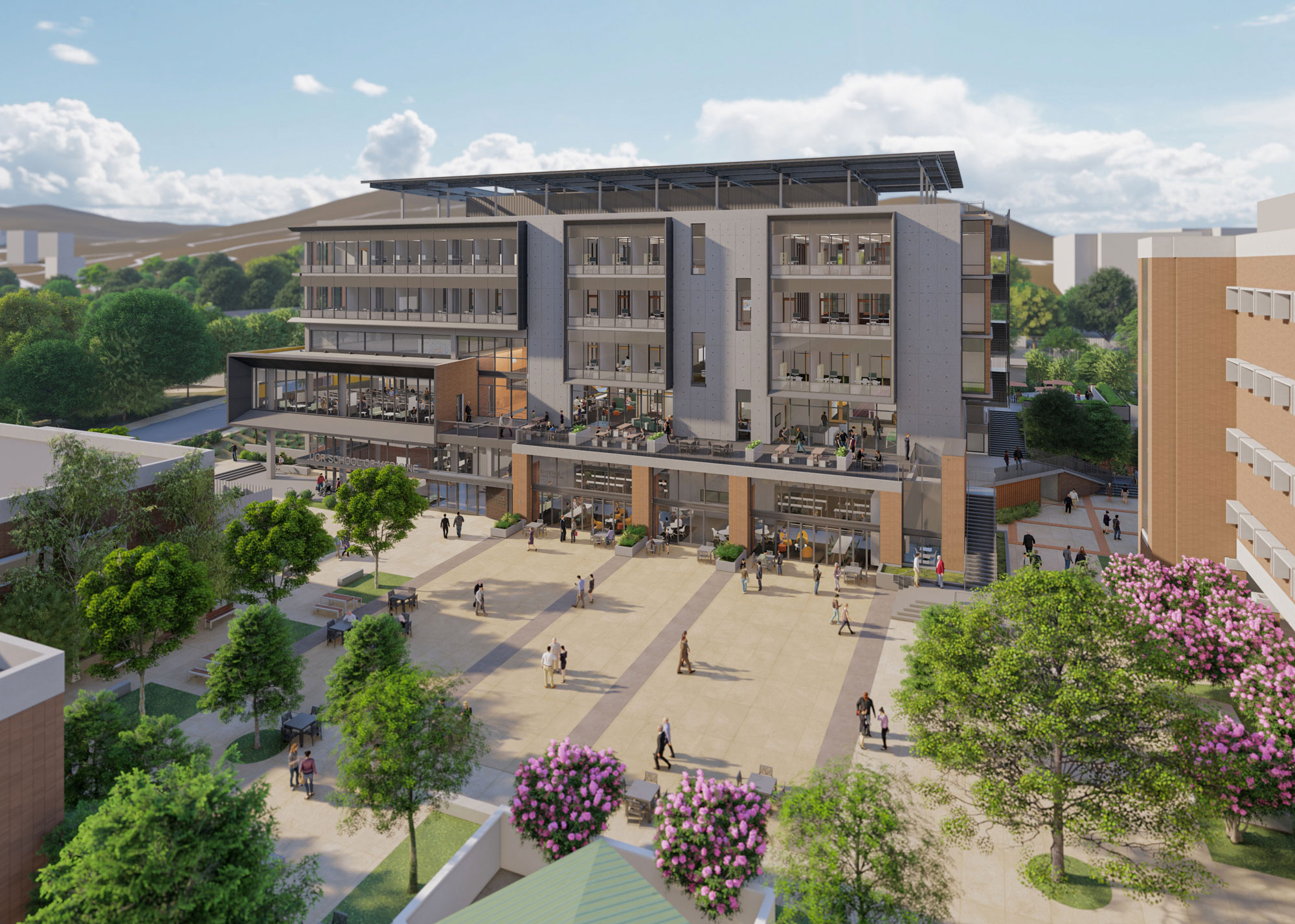
The design-build team of CO Architects | Hensel Phelps is working together to create a new home for the School of Medicine at the University of California, Riverside. Education Building II, or EDII, will be a flexible and adaptable home for students, faculty, administrators and staff. Its design promotes connections, provides universal accessibility, and prioritizes flexibility for future changes, all while increasing visibility for the School of Medicine, both on campus and within the broader Riverside community.
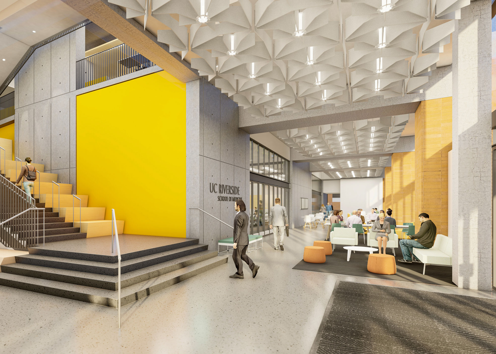
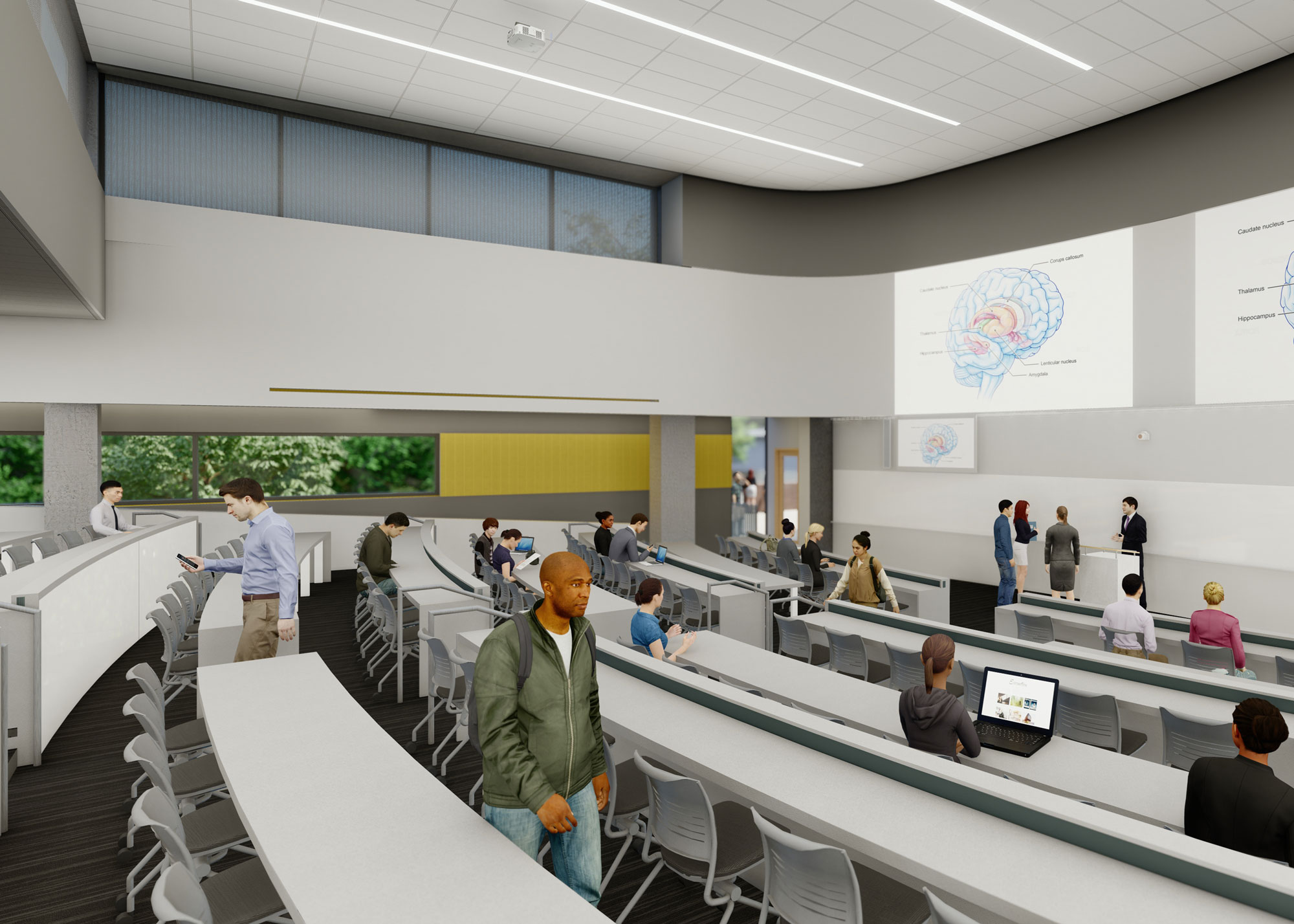
The interior program concentrates stacked zones with spaces for instruction, collaboration and administrative offices. Levels 1-3 provide open public gathering spaces, large group active learning spaces, student life and an interactive tiered classroom. The large teaching environments are adjacent to ample pre-function space that seamlessly connects to the outdoors and provides students space to informally gather, socialize and study between classes.
The student services administration department is alongside student life space and problem-based classrooms on Level 3. EDII will provide much needed space for the entire SOM administration with a wide variety of departments and initiatives co-located on Levels 4 and 5 of the building, including the Dean’s Suite.
The interior spaces are light, bright and timeless, featuring white walls with polished concrete floors, exposed buff-colored brick, and abundant interior glass partitions. Pops of color serve as exclamation points and and contribute to wayfinding throughout the building. The furniture design will enhance the architectural design and material palette, while ensuring flexibility, durability, sustainability and beauty.
The building’s exterior design, massing, materials and coloration are influenced by surrounding buildings and reference the extensive use of buff-colored brick, glass and metal panels on campus. Also influencing the overall building design is the inspiring natural hillside landscape of the site and views to the Box Spring mountains beyond. Each facade of the building has a unique expression that responds to its solar orientation and promotes sustainability and functionality, and amplifies the building’s ties to nature. The ample use of glass takes advantage of views but also provides natural light deep into the floor plate. Terraces and balconies on multiple floors offer fresh air and respite.
The front door of the EDII building transforms the eastern edge of campus by creating a high-profile identity for the School of Medicine. This new front door is on axis with the existing entry door to the Education Building I and connected by a colored paved walkway – tying the two buildings together to create a new School of Medicine Plaza that will serve as an overall campus resource for daily respite, as well as a “town square” for large and small gatherings. This site feature intrinsically links the two buildings, along with the other surrounding buildings, forming a new and vital School of Medicine Precinct.
Well-designed outdoor spaces are critical opportunities to extend the building’s program from the indoors to the outdoors. A diversity of outdoor spaces surrounding the building range from quiet, contemplative small-scale spaces to moderately sized areas for group interactions and gatherings to plazas for large-scale events and celebrations. Interior communal spaces are located where they can be accessible and flex between indoor and outdoor spaces. Furnishings within these spaces encourage socialization, collaboration, respite and relaxation with moveable tables and chairs.
