NeoCon Recap
Neocon connects designers, architects with end-users, manufacturers, dealers, and more with nearly 1 million square feet of exhibits, booths and influential speakers. COworkers who attended the event in Chicago last week share their insights and highlight some of their favorite products and brands from this year’s showcase.
Last week, COworkers James Simeo, Lois Lee, Sona Aroush and Sussan Movassagh attended Neocon in Chicago. They spent three days in this curated environment made for the commercial design community. Neocon unites its designers, architects, end-users, manufacturers, dealers, service providers, associations, educators and students with nearly 1 million square feet of exhibition space filled with booths and keynote speakers.
What was the coolest product you saw at NeoCon?
James Simeo (JS): There is a lot of effort being put into the prefabricated phone booth/virtual meeting booth for single or double occupancy. Many are very stylish and look great as standalone sculptures within any office environment. It is also always interesting to see what colors are trending in fabrics and paint finishes. There has been a huge push in the past several years in the furniture industry to increase sustainability in terms of materiality and production. We, as architects, can learn a lot from their efforts and how they tell their sustainability stories.
Lois Lee (LL): There were a lot of mobile charging station products that were showcased, and pods. Additionally, there were a number of eco-friendly, recyclable products. It was eye opening to see the changes that the pandemic, as well as global issues, brought about and how design is used as a tool to adapt to changes, create flexibility, and respond to challenges at hand. What I appreciated most about the NeoCon was seeing how everything was set up – the branding, the colors, all the efforts that go in to really showcase a product in the most unique way.
Sona Aroush (SA): It was wonderful seeing everything in person, especially since this was the first Neocon in person after the pandemic. It was great to see how many products, work and development has been completed during the last two years. There was a huge emphasis in understanding the new work/life balance and hybrid workspace, focusing on research and development of hybrid workspace within all the different manufacturers that were at NeoCon. The common themes were technology, privacy, and spaces to give people the ability to make a phone call or call into a virtual team meeting.
Sussan Movassagh (SM): Pop of colors in materials such as in glass, textiles, furniture, felt panels, marker boards, etc. Biophilia: lots and lots of plants in interior spaces and in patterns of wall coverings, fabrics and organic form of products and furniture. Flexible spaces: for hybrid work, collaboration with transparency and openness. Living room style spaces: comfy, elegant with comfortable and unique furniture pieces, beautiful artwork, plants, and beautiful lighting.

What was the most enjoyable booth? What made it unique?
JS: Herman Miller, Knoll and Teknion showrooms all stood out. The Teknion showroom was the most comprehensively and thoroughly curated…everything seamlessly held together from one area of the showroom to the next. Plus, they had the best afternoon desserts which is always a treat.
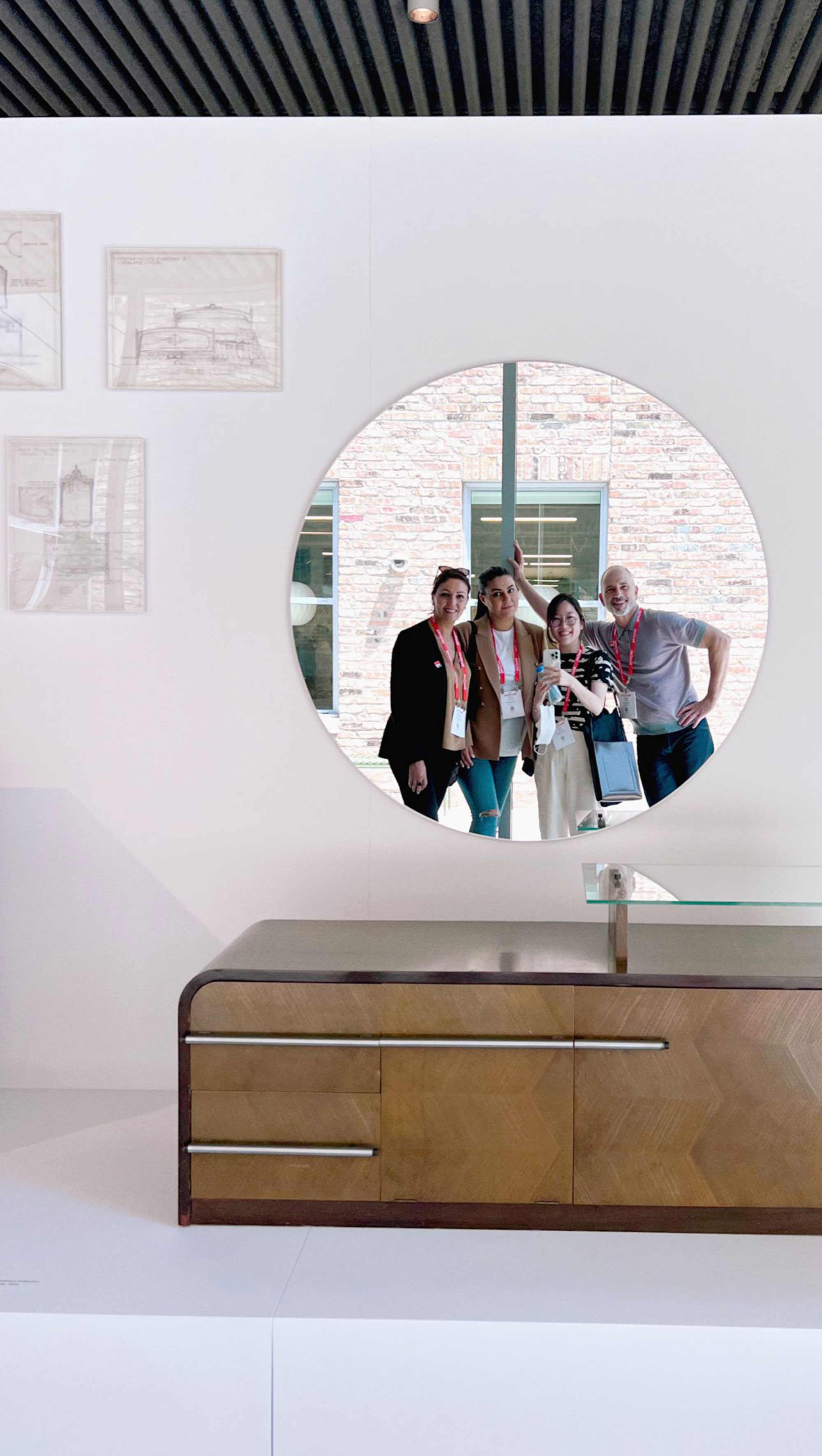
LL: The Herman Miller floor at the Fulton Market had an exhibit showcasing the history of Herman Miller – perfectly curated with textiles, old catalogs laid out with graphic standards that are still applicable to modern day, drawings, illustrations, prototypes, and vintage pieces. It was unique compared to other ‘booths’ in that, it wasn’t about being social, or necessarily to sell a new product line, but really to learn about the brand’s story and appreciate what makes it so special.
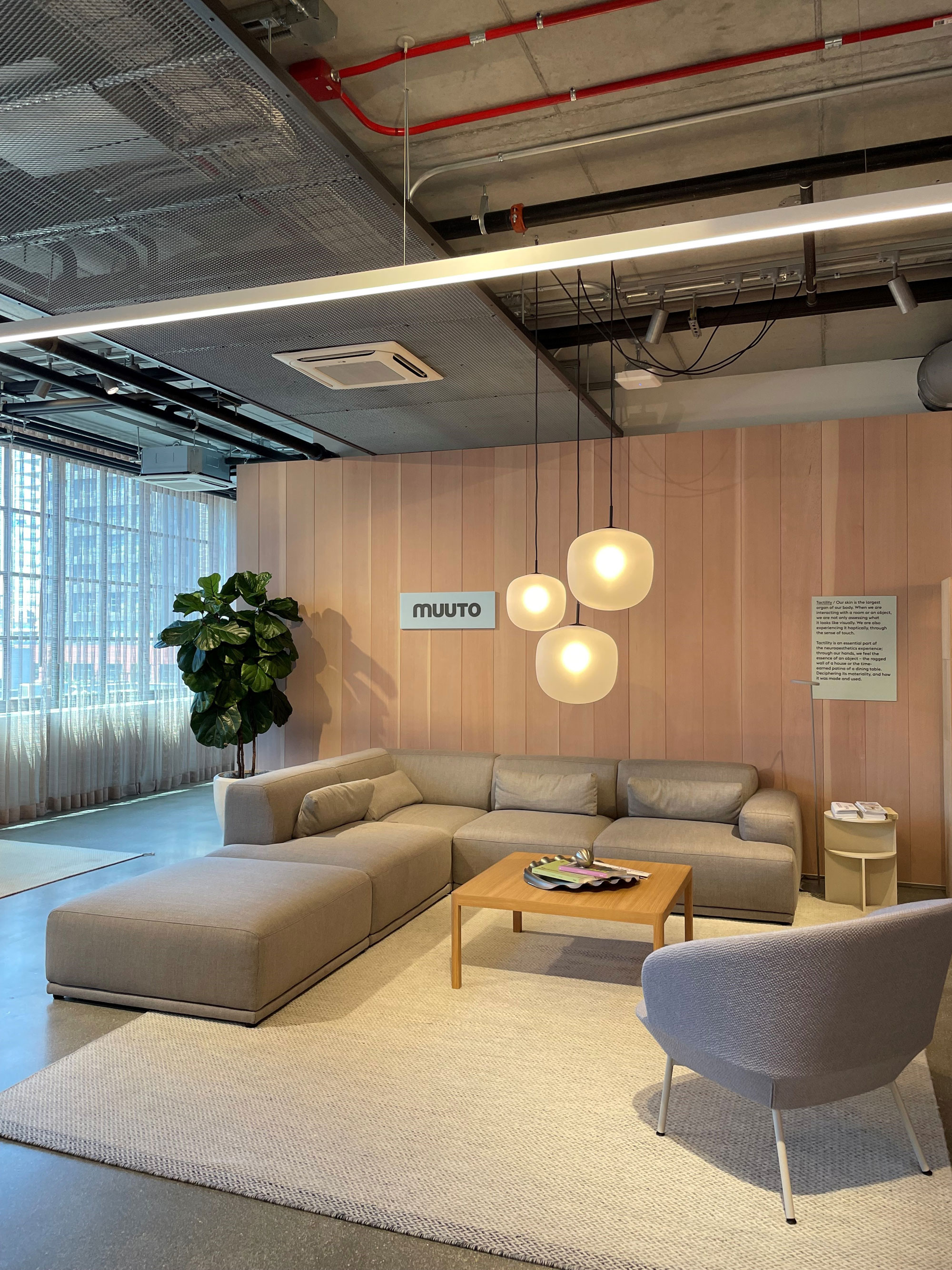
SA: Herman Miller at Fulton Market had a beautiful space…seeing all the classic Eames pieces is always such a nice treat. Muuto would have to be one of my favorite showrooms…all the furniture, accessories, colors, and branding was so perfectly curated.
SM: Herman Miller and Knoll at beautiful Fulton Market. Having their spaces outside of the Mart at a street scale rather than in a tall building was a great experience. The craftsmanship, the beauty and the legacy in their products is at a different level and is very enjoyable to see, touch and feel. The way they displayed pieces in their showrooms filled with natural light was extraordinary.
What product do you think you will use in your next project?
JS: I really want the firm to start looking at how we can start to utilize more modular, pre-fabricated meeting spaces, offices, 1-2 person virtual meeting pods, etc.
LL: We were heavy on ‘what would be great for our office’ as we were roaming around. And there were a couple that caught all our attention. We also saw a few new chairs from Steelcase and Knoll that would be a great option to use for our classroom type spaces. I’d like to see how I can incorporate some different palettes — color, texture —into our projects as well.
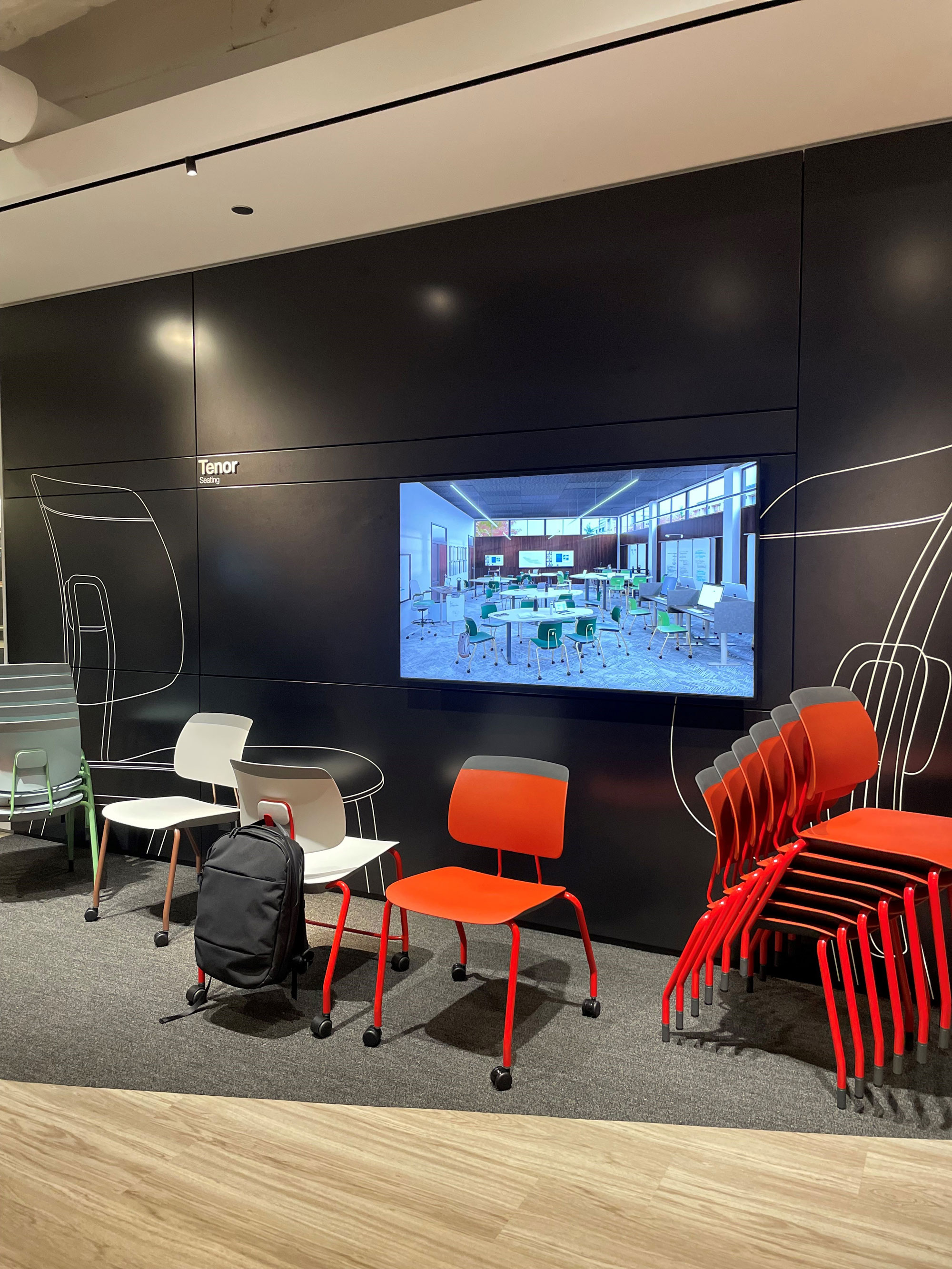
SA: Steelcase launched a new stacking classroom chair – “Tenor” – lots of pops of color options, casters, backpack hanging capabilities, and a simple design. Pergola Workspaces from Haworth had a new, freestanding architectural workspace that functions as an office spade divider.
M: Herman Miller Knoll and Steelcase furniture and their Healthcare line. Alure Glass walls with curved corners, colored glass partitions and marker boards from Clarus, and Ghent. Modular systems for open collaboration spaces from several manufacturers – Muuto, Davis, Stylex, Arper are few others that their latest products stand out.
Who was the most inspirational speaker? What lessons or tips did you take away from their message?
LL: There was a keynote by Bruce Mau, a celebrated graphic designer, strategy designer, experience designer, artist, the list goes on and on. This celebrated designer and his work does not fit in a one size fits all model, which I really appreciate. For those of us in architecture, we’ve all heard of, held, and skimmed through the massive S, M, L, XL book — this is one of the many books he’s collaborated on with architects. He touched on a lot of points that we are very much aware of, while serving as a much-needed reminder. Through his work, he expanded the notion of what design is and the impact of design but brought it all back to empathy being the core concept of design—”caring for the citizen, community, and ecology.” Design should be approached more holistically, understanding the full context of a problem and the challenges, to design life-centered solutions.
SM: Between Art and Design with Nick Cave and Bob Faust. I expected to hear more about their work and process, however the discussion was more focused on justice, equity, diversity and inclusion.
Who had the best giveaways?
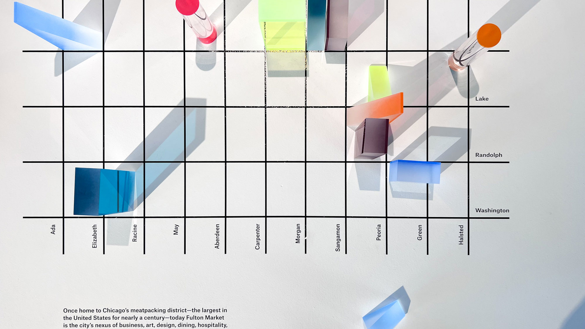
JS / LL / SA / SM: MillerKnoll – Herman Miller and Knoll merged this past year, but still have separate showrooms. The four-block walk between the two showrooms was an interactive experience that they curated for visitors with free give-aways at each corner and mid-block storefronts for free smoothies, gelato, and cold-brew coffee. This was very thoughtful as the weather was so hot and humid and people needed to recharge after their long walks from showroom to showroom.
What other tips or comments do you have on the event?
JS: I think that MANY different folks would learn a lot by attending NeoCon. Our office (thank you, Sona) sets up individual appointments at each of the showrooms to see the latest product releases or those products that are not available to see in the LA showrooms. Whether you specify furniture or not, we all design spaces where furniture resides, so it is vitally important to understand dimensional, aesthetic, and material qualities of the furniture that our day-to-day occupants will be using. There is a lot to be inspired by, whether it is how materials come together, the engineering of the products or the coloration being represented. The showrooms are curated and designed with a lot of thought and effort; there are many inspirational moments for our own work
LL: Tips? Comfy shoes are a must and humidity is never comfortable.
SA: Do not forget comfortable walking shoes, large tote bag for brochures, catalogs, and giveaways, lots of water, and a phone charger.
SM: Spread the showroom visits with appointments on the first two days, so you can have a focused visit of the showrooms with a rep instead of wondering around with a big crowd. I suggest going on the third day on your own and take good photographs with no crowd. Comfortable shoes, a light sweater for strong AC inside the showrooms, large tote bag for brochures, and phone charger are must.
